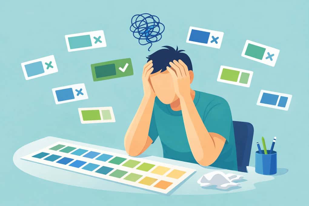
At CauseLabs, we know accessible design shouldn’t be a guessing game. For years designers have relied on contrast checkers that tell you whether a color combination passes or fails accessibility standards (like WCAG’s 4.5:1 contrast ratio for text) because roughly 2.2 billion people experience some type of visual impairment.
Our owner, Michael Gillihan, got tired of the endless loop of testing and tweaking color choices. So he built a tool that goes further: it suggests the nearest accessible color that preserves your original hue and saturation, tests both light and dark text at once, and even checks for a “universal” color that works against both.
The Color Contrast Checker makes accessibility fast and practical. Instead of manually adjusting hex values and guessing whether a palette will pass, paste in your colors and get back actionable results. It also tells you when a universal accessible color doesn’t exist, saving you time and frustration.
This tool was built from concept to launch with the help of AI and Michael’s experience in real-world design challenges. It runs in the browser with no account or install required.
Try the Color Contrast Checker, or check it out on GitHub.
It’s free, zero dependencies, and works in the browser. No account, no install, no 4MB JavaScript bundle. Just paste your colors and get answers.
Try the Color Contrast Checker: https://www.causelabs.com/contrast-checker/
Original post on the tool: https://mikegillihan.com/building-an-accessible-color-palette-without-the-guesswork/

