Your nonprofit’s website isn’t just an outward expression of the positive impact you’re making in the world. It can make or break the perception of your brand, and determine whether visitors join you in supporting your mission.
The best nonprofit websites have clear messaging, design, and accessibility that centers donors, tells the organization’s story, and inspires people to support them. Said more simply, they draw eyes, engage, and convert your audience.
Whether you’re refreshing your website, redesigning it, or building a new website from scratch with a new strategy, looking at good examples helps.
Why is a Good Website Essential for Nonprofits?
First impressions are everything. The average time spent on a website is 15 seconds. That’s it! That’s how long you have to capture someone’s attention about the positive impact your organization makes. If you haven’t grabbed the visitor’s interest in 15 seconds, you probably won’t. The exception is if they already bought into your mission.
It doesn’t take much to drive visitors away. A poorly designed website with long load times can inhibit visitors. So can a color scheme that hurts your eyes and long, run-on sentences.
The best nonprofit websites are well-designed, match your audience’s desires and needs, and provoke engagement. These websites require more than just a keen eye for what looks good. They require strategy.
The Top 10 Best Nonprofit Websites
There are tons of amazing nonprofit websites out there. We chose the 10 we think are the best. They aren’t in any specific order, but we explain below the screenshots of each site what we love about it.
1. The Refugee Project
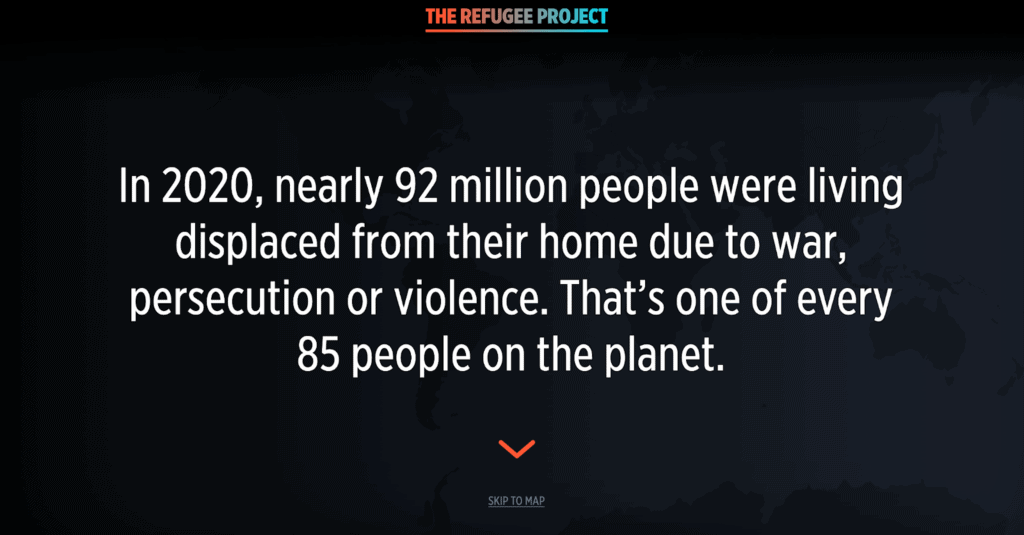
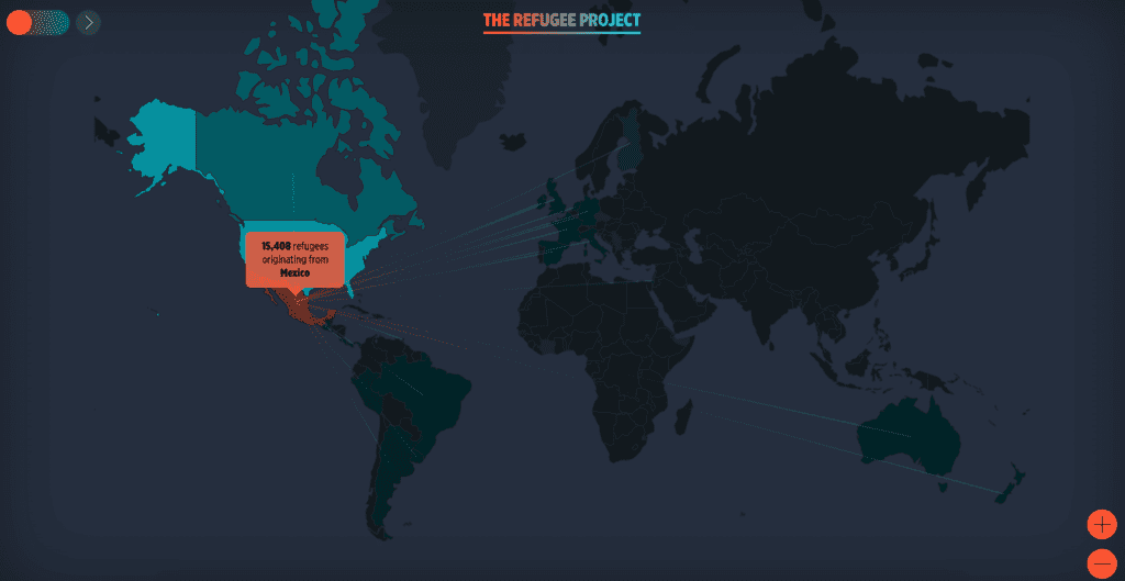
Why We Like It
The Refugee Project captures your attention immediately with dynamic storytelling. The project increases awareness about the millions of people worldwide who flee their homes to escape difficulties. Instead of blocks of small text, the website relies on interactive maps and graphs that powerfully visualize refugee data.
2. Acumen.org
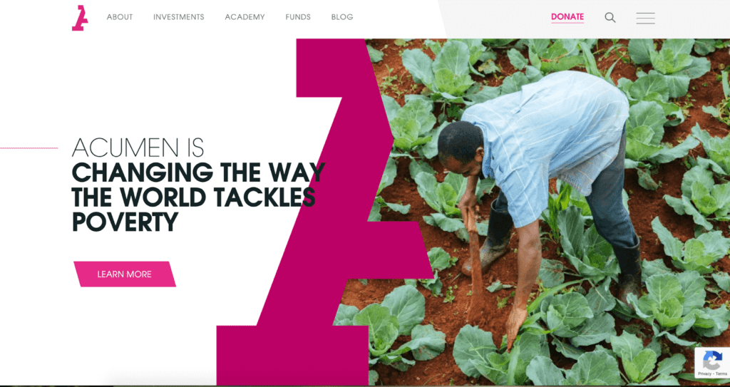
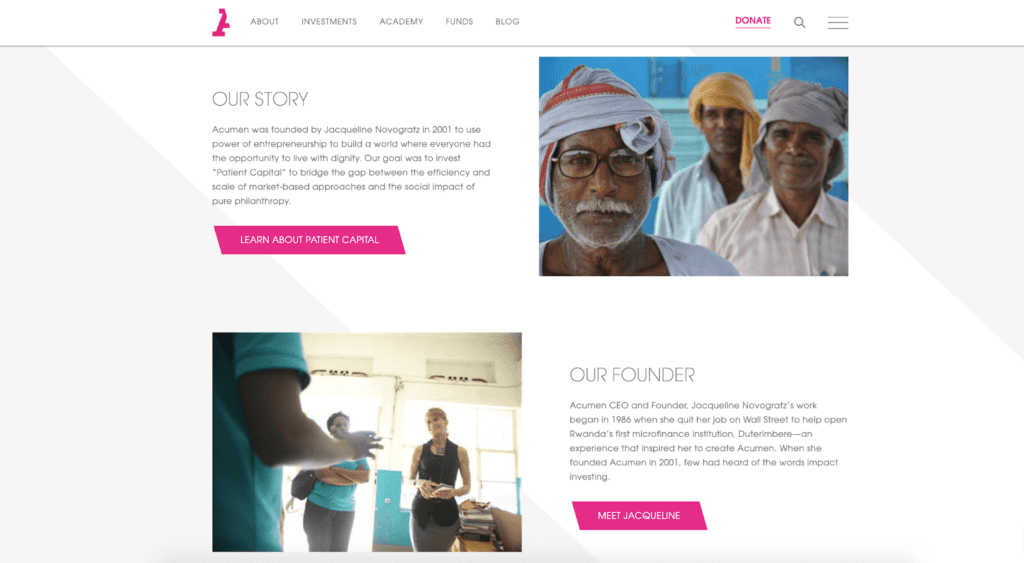
Why We Like It
Acumen invests millions of dollars into impoverished communities to create lasting change to economies worldwide. It’s a complicated process, but the website makes it intuitive for visitors to understand. The easy-to-navigate menu and crisp impact pages don’t overwhelm. Acumen showcases beautiful brand design by using the slant from its “A” to visually unite the site.
3. IllumiNations
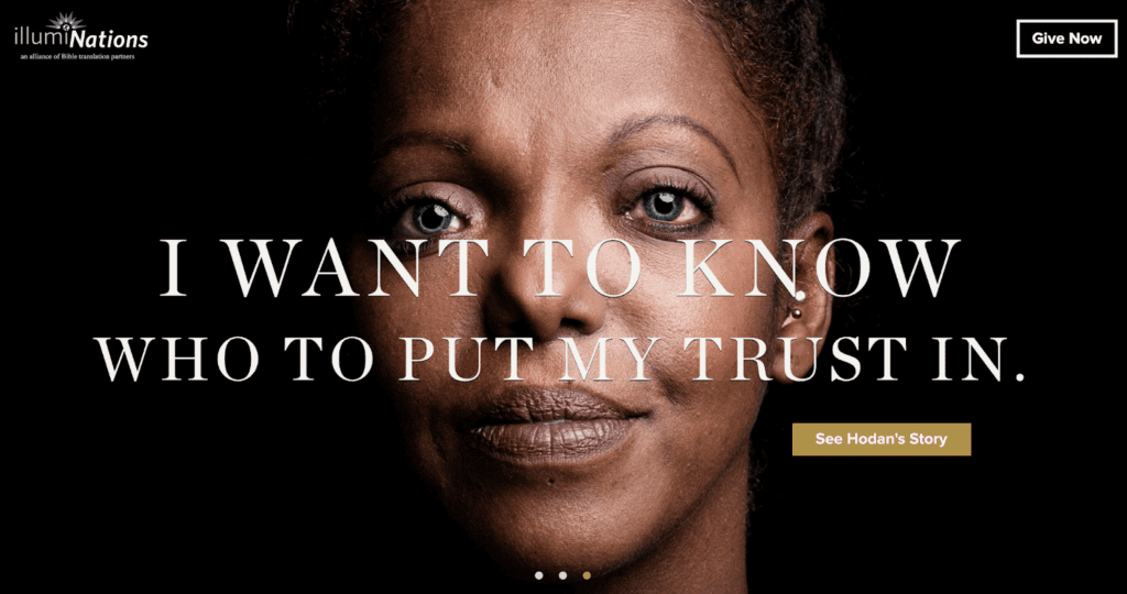
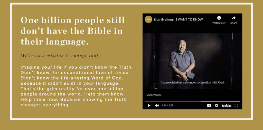
Why We Like It
Striking imagery and authentic storytelling are front and center on for illumiNations. The mission of illumiNations is to make the Bible accessible to all people by 2033. The “I Want To Know” campaign shown above provides the stories of transformation from native speakers themselves. Another feature we love is on the homepage where there are quick giving opportunities framing the header text.
4. Access Now
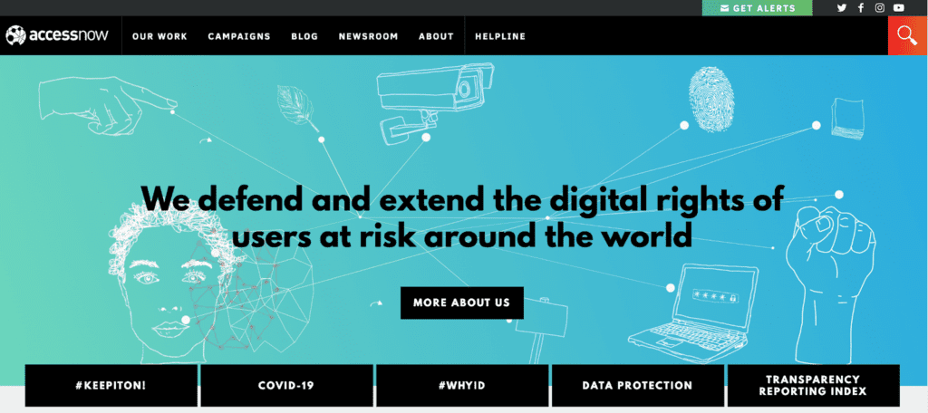
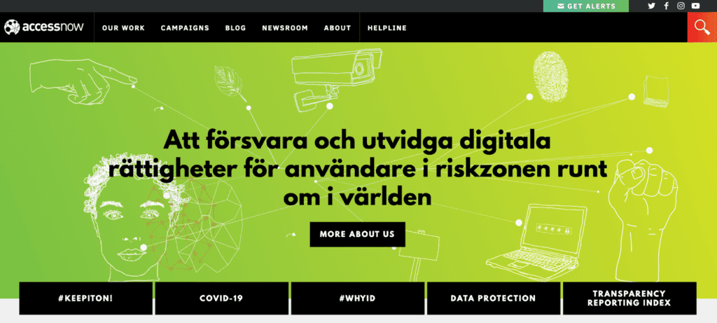
Why We Like It
Access Now knows it has a worldwide audience, as evidenced in its multilingual hero content and blog posts. The organization defends and extends the digital rights of at-risk users worldwide through various channels, including policy and advocacy.
5. Toolkit iSkills
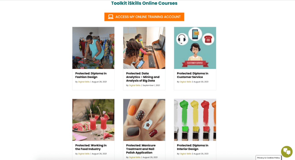
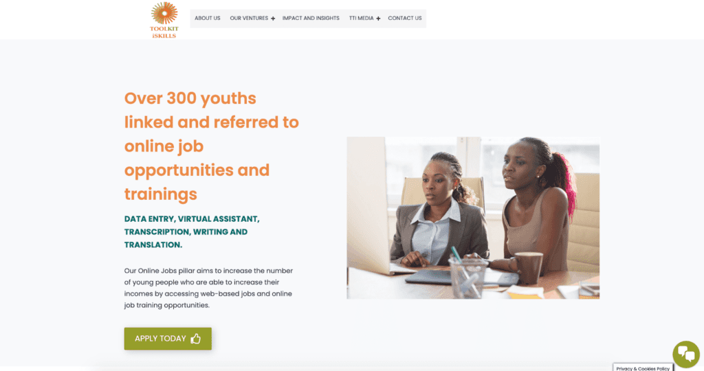
Why We Like It
The mission of Toolkit iSkills is to empower vulnerable youth by equipping them with world-class life and professional skills demanded by current and future labor markets. The organization does this through online learning programs accessed through a gated member access education portal. Providing levels of access helps make the site functional and helpful for multiple audiences.
6. International Rescue Committee
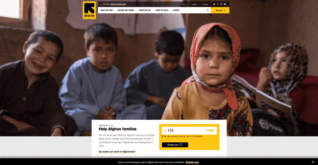
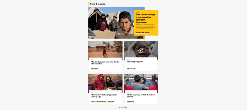
Why We Like It
The mission of the International Rescue Committee is complex, but its website clearly states and simplifies it. The organization responds to the world’s worst humanitarian crises. It helps displaced people and refugees to survive, recover, and gain control of their future. We like how the site’s homepage immediately tells you where the greatest need is at that time. It then allows for direct donations to that area.
7. Alex’s Lemonade Stand Foundation
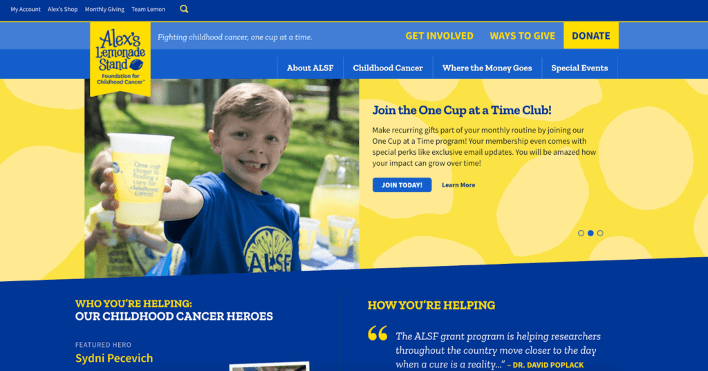
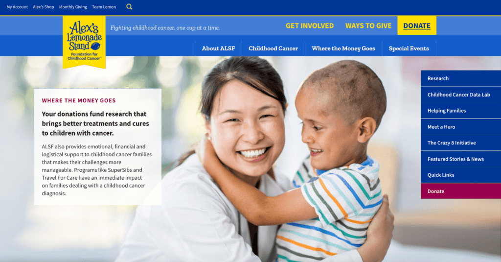
Why We Like It
If you’re looking for a fun, fresh example of how to sprinkle branding throughout your website, Alex’s Lemonade Stand is it. The organization funds research, raises awareness, supports families, and empowers everyone to help cure childhood cancer. ASLF is also transparent about finances. The site allows visitors to get a rundown on the “Where the Money Goes” page.
8. I Had Cancer
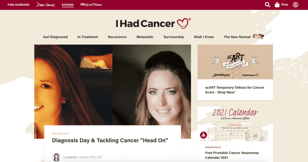
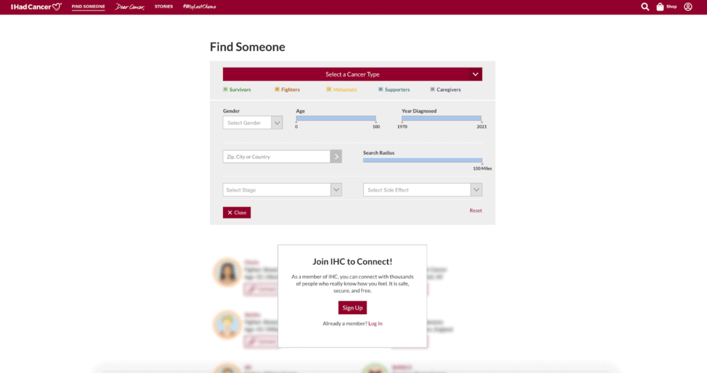
Why We Like It
I Had Cancer’s website immediately creates a sense of community and belonging. Its “Dear Cancer,” #MyLastChemo, and story pages are evidence of this connection. Joining the IHC community allows visitors to connect with thousands with similar experiences. The “Wish I Knew” page educates people with blog posts like, “5 Things to Never Tell Someone Fighting Cancer.”
9. Save the Rainforest
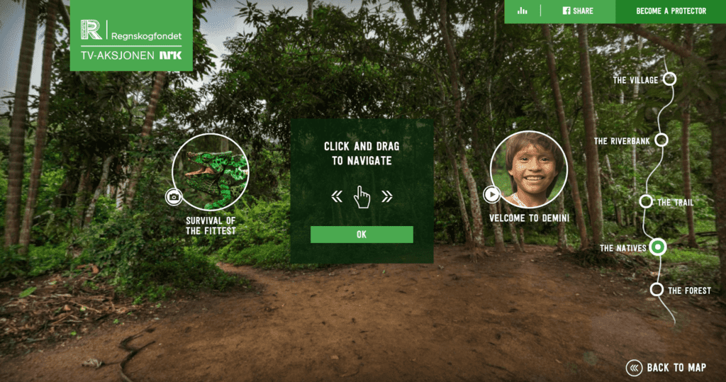
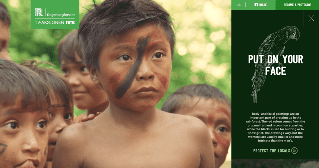
Why We Like It
There’s no denying it. The interactivity throughout Save the Rainforest’s website is incredible. Visitors are at the heart of the issue by taking a simulated trip through the rainforest. Videos and striking photography help to educate about why it’s important to protect the rainforest.
10. Names for Change
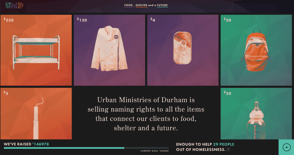
Why We Like It
A project of Urban Ministries of Durham, Names for Change aims to alleviate homelessness. They do this by allowing visitors to pay to name the items that connect those they serve to food, shelter, and a future. Interactive features educate and engage users about the preciousness of items. It’s clear that donations of varying sizes are welcome and encouraged. You can choose to name a sugar packet for $1, a bookcase for $160, or a walk-in freezer for $1,750.
Key Features to Build One of the Best Nonprofit Websites
What features do you need to build a website that’s among the best? It’s pivotal first to understand your audience and their unique needs. Then the question becomes how to use technology to serve them.
Key features to consider when aiming to build the best nonprofit website are
- Brand Clarity. What is the mission of your nonprofit? Who are you? Who do you serve? Reflect this in all aspects of your website, from its copy to colors.
- Donation and Actions. Your organization can’t fulfill its mission alone. You may rely on the generosity of others to make a difference. A “donate button” can be visible on every page of your website. You can also use special integrations to set a campaign goal or for supporters to create peer-to-peer campaigns.
- Mobile Optimization. Your nonprofit has a better chance of converting visitors into donors with a mobile-optimized website in a mobile-centric world. To make sure your website is mobile-friendly, you can use Bing’s free mobile-friendly test tool. It analyzes your site’s URL to let you know whether the page design is optimized correctly.
- Translation Capabilities. People prefer to engage with websites in their native language. It establishes trust, and connection, ultimately leading to more engagement. You might think, “Eh. We’ll just use Google Translate.” But sometimes it’s not sufficient. You need to translate correctly to speak with your audiences authentically. Hiring a translator is occasionally necessary.
- CRM Integration. While custom integrations aren’t visible to website visitors, they make a tremendous impact for your staff. Custom integrations with your Customer Relationship Management system are a great way to track critical information and relationships with your donors and the people you serve. Your CRM is like a virtual address book. It’s a powerful marketing tool, allowing you to target specific donors to communicate with them about future campaigns.
- Compelling Storytelling. Telling a powerful story is a key to connection. Donors want to know the impact of their generous contributions. Showcase the names and faces of those you serve through photography and video to help bring your mission to life.
How CauseLabs Can Help
Looking to other nonprofit websites for inspiration is helpful, but remember –– the best nonprofit websites don’t fit into a cookie-cutter mold. They allow their website to fully reflect their brand, audience, and mission, keeping those they serve at the forefront. Contact CauseLabs today to help build or redesign your nonprofit website to better help those you serve.